My Favourite Creative Practitioners
For the next few months, I'll be using this blog to talk about my favourite Graphic Designers and other artists.
Max & Eduard
Max & Eduard
Last year I've researched the history and orientation of the Helvetica typeface. Helvetica typeface is one of the youngest typefaces I've research so far. This means that it's quite modern. Here's some information that I've discovered about the Helvetica Typeface and the creators Max & Eduard. Although, they're not entirely graphic designers, I still love the fact that they have such a huge impact the design of type today.
"The original Helvetica was designed in Switzerland in 1957 by Max Miedinger and Eduard Hoffmann at the Haas type foundry (Haas’sche Schriftgiesserei). Haas was controlled by the type foundry Stempel, which was in turn controlled by Linotype."
The original name for Helvitica was actually Die Neue Haas Grotesk. It was closely based on a typeface knows as Schelter-Grotesk. The typeface was created to be something safe and basic. "This neutrality was paramount, and based on the idea that type itself should give no meaning"
The original name for Helvitica was actually Die Neue Haas Grotesk. It was closely based on a typeface knows as Schelter-Grotesk. The typeface was created to be something safe and basic. "This neutrality was paramount, and based on the idea that type itself should give no meaning"
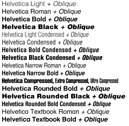
Here's an image of what the Helvetica Typeface looks like:
Here's an image of how Max and Eduard's typeface is also used in today's modern businesses!
No comments:
Post a Comment