Thursday, 28 February 2013

Favourite Artists - iO Tillett Wright

Favourite Artists - iO Tillett Wright

I've been doing a lot of research into photography lately for my latest graphics projects. I came across an amazing talk via TED.com and discovered a photographer who believes in receiving equal rights for the LGBT community. Her photography is raw, natural and exactly the sort of style that I'm looking to create for my project.  

You can see that majority of her photos are black and white. They're candid and beautiful in presentation. They also have an almost vintage feel to it. 

Wednesday, 23 January 2013

Modernism & Postmodernism (1)

What is Modernism

Today's lecture was based on modernism. For the next few lectures, we'll be discussing what modernism and postmodernism is.

There are three stages of modernism: 
- Crisis in the representation of reality
- The Rise of abstraction 
- Abandoning the aesthetics

We discussed each of these stages thoroughly and I also went ahead and researched into each stage for myself.  From what I have gathered from this lecture, I understand that Modernism can be seen as a sort of development in design of all kinds. It is also argued that we might not be in a modernism stage, but rather, we are in a Post Modernist stage.

Crisis in the representation of reality:
"representation could be thought of as means of depicting or portraying of a subject, which relied upon the connection between the rendition and the original". 
We discussed a great deal about how the representation of reality has changed in design. Photography has contributed greatly to the way society sees images. Before photography, artists were hired to paint an image of what they saw. If someone where to see that image/painting they only had the option of believe it for what it was. It could be argued that photography has drastically changed the way in which designers represent an image.


"In a similar manner, artists turned to photography as a means of documentation outside of the content of abstract, purely conceptual art and instead focused attention on the political and social climates connected to the image" http://www.andrewschroeder.net/2009/03/24/crisis-of-representation/

The rise of abstraction:
We spoke briefly about abstract art and how it may a new way in which designers view imagery. Abstract art could be a way of breaking out of a set of rules. Abstract art has only recently been accepted as an art form. Realism in art and design is something that will always be there but abstract art is almost like a rebellion against the traditional way of designing.
"Artists like Monet, Manet, Pissarro and others, bravely all helped break out of the classical tradition , allowing us to see that art could be more than we had come to accept. In their time these paintings were seen as revolutionary". http://www.arts-fine.co.uk/paintings-for-sale/abstract-realism.html
Here are some examples of modern abstract art.
abstract realism
"This abstract realism is a form of art that sits between realistic depiction of the world and a non representational abstraction. No longer are the two separate and opposed, but come together to strengthen each other and form an alloy. The artist who can make realistic images, but takes that skill and creates a more abstract painting that is greater than sum of them both"

Abandoning the aesthetic process:
This was a part of the lecture that I was especially interested in. The reason for this was due to the fact that I study graphic design. Graphic design can focus heavily on rules and specific styling. Despite the fact that we have some kind of artistic licence, we are still expected to follow an unspoken set of rules and formatting in order for our work to be considered. 
Abandoning the Aesthetic process is a time in which artists dared to stop following a set of rules in order to make aesthetically pleasing art work. Modernism is basically about abandoning the rules. 
"If the rules inherent in one tradition are abandoned or proscribed, another set of rules will replace it. Thus we find that the modernists, in breaking all the rules of harmonious composition, in turn generated a set of rigid rules that are simply the opposite of the rules they replaced, rules that guarantee that complex coherence is permanently denied."
I found this quote very candid in the way it explained that explains how no matter how badly artists try to diminish "the rules", we still manage to develop a new set of them. 


Monday, 14 January 2013

My Favourite Creative Practitioners - Max and Eduard

My Favourite Creative Practitioners

For the next few months, I'll be using this blog to talk about my favourite Graphic Designers and other artists.

Max & Eduard
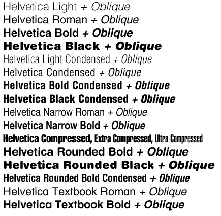
Last year I've researched the history and orientation of the Helvetica typeface. Helvetica typeface is one of the youngest typefaces I've research so far. This means that it's quite modern. Here's some information that I've discovered about the Helvetica Typeface and the creators Max & Eduard. Although, they're not entirely graphic designers, I still love the fact that they have such a huge impact the design of type today. 

"The original Helvetica was designed in Switzerland in 1957 by Max Miedinger and Eduard Hoffmann at the Haas type foundry (Haas’sche Schriftgiesserei). Haas was controlled by the type foundry Stempel, which was in turn controlled by Linotype." 
The original name for Helvitica was actually Die Neue Haas Grotesk. It was closely based on a typeface knows as Schelter-Grotesk. The typeface was created to be something safe and basic. "This neutrality was paramount, and based on the idea that type itself should give no meaning"

Here's an image of what the Helvetica Typeface looks like:
Here's an image of how Max and Eduard's typeface is also used in today's modern businesses!


Friday, 14 September 2012

Modes of Analysis

Analysis Elle Magazine 

This week, I attended a lecture about Modes of Analysis. This year's lecture was definitely a lot different from what we were all used to last year. Last year, we were very focused on simple creative cultures and basic terminology. This year is certainly a lot more intense and requires a great deal of note taking in order for me to keep up! For this session, we were given a series of tasks to complete in our own time. 


Undertake a Form and Content analysis of an object or image. You should detail this process in writing on your blog
I'm still not entirely sure I understand modes of analysis yet. 
From what I have learnt from the lecture, content analysis consists of two things; Iconography and Iconology. So, with the knowledgeable that I have on Iconology and iconography, I will analyse this image of Gabourey Sidibe that I found on ELLE magazine a few years ago that caused quite a lot of controversy. 
ELLE magazine is known for using A-list celebrities as part of their front cover art work and majority of the front covers they use are usually full length body images of the celebrity at the time. Here's an example of the sort of ELLE covers that I am talking about:

You can see that in most of the front covers, the images are full length body photos unlike the image of Gabourey Sidibe in her front cover. 
From the way that the image is focused close up to Gabourey's face, you can see that the director, editor did not want the target audience to focus on her body. Also the way her shoulders have been covered up in comparison to the women in the covers below is quite a lot. Compared to the women in the image below, Gabourey's entire body has almost been cloaked over.

I found a very interesting article that commented on the skin colour change of Gabourey's face. It stated that "The 27-year-old is one of four celebrities to appear on four separate covers for its 25th anniversary issue. In the image Sidibe’s skin appears to be several shades lighter than her normal colour. The magazine said the four celebrities – SidibĂ©, actresses Megan Fox and Amanda Seyfried, and Lauren Conrad, the reality star – were chosen as examples of young women who were “changing the world”. ELLE has also been criticised because each of the other three cover girls are shown in full length photographs while Sidibe’s image is cropped at chest level.In a statement the magazine said that “nothing out of the ordinary” had been done to the photograph". 

Make a list of genres that are evident in your discipline
I thought that this was quite an exciting task seeing as I don't know all that many areas of Graphic Design. It was a great opportunity for me to research a little bit and findnabout certain genres that I might be interested in for the future. Here's what I found

- Editorial Design 
- Logo Design
- Branding
- Motion Graphics
- Animation
- Typography
- Web Design

This information below was taken from a website called Ezine Articles. 
Basically it can be categorized into four distinct categories: 
1. Image-based 
2. Type-based 
3. Image and type 
4. Symbols, logos and logotypes

Article Source: http://EzineArticles.com/5783204


Make a list of styles that you can identify in your discipline
This are the sorts of styles that I know about so far in Graphic Design. Some of what is listed below are gathered from the internet.

- Vintage/ Retro
- Swiss Style AKA International Style
- Urban Design
- Mainstream Arts

I also found this article about the trending styles within Graphic Design. I found this article very useful for personal use. http://www.creativebloq.com/top-20-graphic-design-trends-2012-1212327
Here are a few examples of what the article contains:


 Marion Deuchars

"Graphic Design Trends: Royal Mail Stamps by Marion Deuchars

With polished digital perfection everywhere, the raw, flawed product of the human hand is becoming increasingly appealing, especially in contrast to overly slick digital design that’s too clean and crisp to have a soul of its own. Starting in reaction to the homogenisation of type in emails, texts and tweets – where the personality of handwriting is stripped away – hand-written type adds a real sense of authenticity to a piece of design, as well as a whimsical edge"


Thursday, 13 September 2012

Introduction To Year 2 Creative Cultures

Introduction


This year, we'll be continuing with our study on Visual Cultures and the industry. I'm definitely looking forward to my future lectures. This year I hope to gain a wider range of knowledge in terms of creative practitioners and possibly learn a little bit more about signs and semiotics. This is mainly because I feel that these two areas of visual cultures last year greatly contributed to my understanding and confidence in my specialist pathway which is Graphic Design! 

Last year, Visual cultures grew to be my favourite part of the course. I thoroughly enjoyed learning about the history and future of art and design and was hoping to learn something similar this year. Not to my surprise, we learnt something completely different this year. Learning something new can only ever be a good thing! We focused a great deal on Modes of Analysis. This is something I knew nothing about and was totally open to learning a bit more. In the next post, you'll find out what I learnt this week and my completed tasks from the lecture. 

Monday, 16 April 2012

Saturday, 3 December 2011

"He's At Your Window!" (Semiotics: Image As Language)

Deconstructing Another Music Video


The video I have chosen to breakdown and analyse is a music video by an artist known as Tyler The Creator. The song in the video is called "She". No, before you actually play the video, I would strongly advice that you read the lyrics also. This is because some of the lyrics relate strongly to most of the content in the video therefore, I will be analyse a few of them too. This is because signs may not always be visible, sometimes they're in the words that we say also. sometimes we need words in order for a visual sign to make sense. Here is a link to the song lyrics http://www.killerhiphop.com/tyler-the-creator-she-lyrics/


Scene 1
In this first scene, you can see a small group of young men playing what looks like a gambling game. This scene was based in what I believe is an upper middle class neighbourhood. So, the fact that they were able to clash what is usually related to ghetto living with an upper class neighbourhood already tells us that the rest of the video won't be "Airy Fairy". The game that they were playing may suggest that they could be in a gang. Also the durags that two of the boys are wearing may also suggest the same thing. This can be a symbolic and/or indexical sign. What they're playing and how they are dressed could send across the message that they may be gang members. The fact that the scene is in an upper class neighbourhood may send across a completely different message also because gangsters are mostly assumed to dwell in the ghetto. We, as a western society, may understand their fashion as something associated with gang activity and "ghetto behaviour" but someone on the eastern side of the world may not associate such dressing and activities with the ghetto. 
Here are some important lyrics I heard that I believe also contains some semiotic signs, "...A sword sliced the air...rolled off the bed then shot back, pa-pa. Blood on the sheets, probably spilling from my gash". The line basically describes a gun fight between two men. This line from the song completely backs up what I mentioned earlier about how these three boys may be associated with gangs.


Scene 2
In this next scene, you can see a girl has moved in next door or opposite to where the boys are living. She is what is commonly known in the western world as "The Girl Next Door". This is an indexical sign. The girl next door usually represent an attractive girl that can't be touched. These sorts of storylines are usually associated with American culture and The Girl Next Door almost always indicates an up coming romance of some sort. You can see she's, in a way, "off limits" because her father is standing near by in some of the screen shots that I have taken. Here, in the first shot, you can see her father is watching her closely which shows that he is playing his part as the dominant and protective figure. This is a sign that I'm sure most people of all cultures would be able to understand. 
In this next shot, you can see that he noticed her flirting with the boys and quickly exercises his role as the father figure by pulling her inside the house. Already, you can see that this scene is saturated with signs that show she is an "untouchable item". 


Scene 3
In this part of the music video, you can see what I believe is an indexical sign. The girl next door now has a stalker (Tyler The Creator) and he has managed to sneak into her room while she's sleeping. 
The fact that he has a mask on is an indexical sign. Most people associate masks with hidden identity. The man in the mask is clearly trying to hide his identity in the video which may cause the audience to assume that he is a criminal. The entire scene of Tyler in the girl's bedroom is more or less the same through out. He goes threw her private things and writes her a note on the mirror. This is usually the behaviour of a stalker. I believe the lyrics in the scene illustrate a lot more than the scene itself. Here are some quotes that I pulled out, "You’ll be down in earth quicker if you diss me tonight...I give two for us cause you’re the one that I want...But in the back of my top I'm writing songs about we, we as including I and yourself". This line from the song signifies that the character is dangerous as he is threatening to kill her if she doesn't cooperate with him. He also explains how much he likes the girl but comes across as obsessed and possessive as he explains that he has been writing songs about her and how much she is the only one that he wants. This is a straight forward scene from the song that I believe anyone will be able to understand even without the lyrics.


Scene 4
These two scenes are quite straight forward. You can see that the stalker is actually a normal teenager and is outside with his friends riding his bike, but in a hyper state. The Girl Next Door, however seems to be at ease and is calm whilst riding her bike with her friends. 
She's still clueless and has no idea that there is a stalker following her. Both of these scenes are indexical. This is because you can clearly see that the stalker isn't in his right state of mind because he doesn't appear to be riding his bike in a straight line. However, the girl is calm and relaxed, as her her friends by her side who are all riding their bikes in a straight line. It's the behaviour in the characters that I believe are the semiotics in this scene. Anyone would be able to tell who are the good and bad characters between the two groups of teens by simply watching their actions. The lyrics in this scene are quite similar to that in the shot I analysed earlier. Here are the quotes that I pulled out, "One, two, you’re the girl that I want...Eight is the bullets if you say no after all this. And I just couldn't take it, you’re so motherfuckin’ gorgeous...I just wanna drag you’re lifeless body to the forest. And fornicate with it but that’s because I'm in love with you, cunt!" 
You see that the character still maintains his stalker personality by threatening to kill her and rape her if she doesn't cooperate. Again, he describes his obsession with her by telling her how attractive he thinks she is and how she's the only one he wants. 


Scene 5
Despite the fact that this scene will probably be more recognised among eastern culture, we're still able to understand what is going on in this scene. You see a man dressed in Asian attire  hovering from the ground and singing these lyrics "The blinds wide open so he can see you in the dark when you’re sleepin’...Ain’t no man allowed in your bedroom, you’re sleeping alone in your bed. But check your window, he’s at your window!"
From what I can hear and see in the video, he is a symbolic figure. The way in which he is levitating from the ground and dressed differently from everyone else indicates that he is special and different. I believe that he is suppose to symbolise a guardian angel or some kind of protective spiritual being. Not many people will be able to understand this scene straight away if they are not familiar with other cultures and religions. However, the lyrics that he is singing whilst hovering above the ground, "He's at you're Window!", signify that he is trying to warn The Girl Next Door that someone is stalking her. Therefore, some may catch on and begin to understand the semiotics in this scene. This is why I mentioned before that words can also be a semiotic in some cases. I personally believe that this video was a very good example of how it works. 

Advertisements in the music video
I just wanted to point out some of the advertisements that I noticed in the video. These are not really as symbolic as most of the other signs that I have pointed out. But looking at some of them, you can see how they have slyly fitted each advert into small scenes. Here are some shots that you may have noticed. Adidas, Ford Car, Supreme Clothing line.